Food Styling Rules….it’s time to break them!


So I can remember starting out as a food stylist about 8 years ago and listening to everything and everyone about what looks good and what doesn’t. I would be on set, and if a photographer or an art director said that seeing a basil leaf upside down didn’t look good, it became gospel to me. From then on, no basil leaves upside down….ever! Don’t get me wrong, everyone on set comes with their own aesthetics and opinions, and we all contribute to making the final image but rules suck…simple as that! Another one that I heard a lot and still do, is no pasta noodle ends should be shown. If you are shooting a plate of linguini, for example, all ends should not be seen. It should feel like a continuous spiral of sorts….how unnatural is that? Who decided that the ends of pasta are offensive??? Well no more I say!
Through the years I have developed my own style and aesthetic and I must say that I truly believe it is time to push the envelope and to stop thinking in such rigid guidelines. A major rule that we in the photography world try and stick to, is that elements in the shot should always be in odd numbers. For some reason, when we see odd numbers we react differently then when we see even ones. The randomness seems to feel more natural to the eye, which I totally agree with. However, when I look at an image I am working on, I react more to shapes and objects and I think it’s often better to focus on the entire image being odd numbered as opposed to just the food. For example if we are shooting meatballs, instead of needing to put 5 meatballs on a plate, I think 4 work perfectly with the fifth being replaced by the vessel with dipping sauce, ultimately achieving the same thing.
Luckily, more and more clients are embracing a looser approach to food photography and styling and I think that this is actually a testament to the way their clients, the consumers, are getting more and more interested in food images, blogs, etc. Before food had to be static and perfect so that every element was always visible because the consumer wasn’t given enough credit and it was believed that the only way they would understand the image is if it was being force fed to them. There was no trust that the client would understand the recipe if they couldn’t see everything. Today, we still feel that it is quite important to show off key elements of a product, but by making food look real, and fresh, and rough and tumbly, it allows the consumer to relate to the product in a much more personal way and, more importantly, not be intimidated by it. A reader of a cookbook never wants to try a recipe whose image makes them feel like they can never accomplish the end result. By having crumbs around the plate, or drips of sauce that are not perfect, the food starts to look fresher and less scary. Looser styling does not mean messy and there is a definite technique to making food look more casual and fun. Not always as easy as it looks, but once it is achieved it works so well.
All this to say…the hell with the rules. If pasta noodle ends looks awesome then it looks awesome and that is all there is to it. The way I judge my food styling or anyone else’s is if final shot makes me want to reach in and eat it. That’s all…plain and simple. If it doesn’t achieve this, well that means I need to redo it. Sucks but it’s true. My goal is to make sure my clients concerns are met and that at the end of the day, they look at the shot and want to eat the food. Case closed!
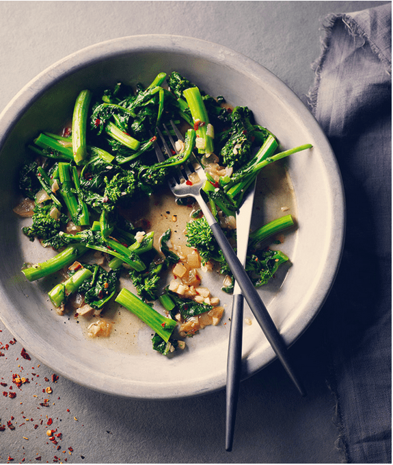
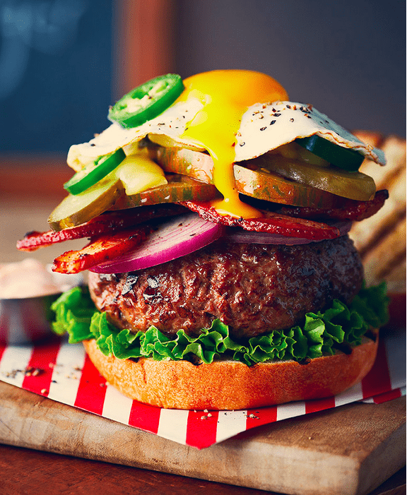
Here are some shots that I have worked on recently that break the rules:
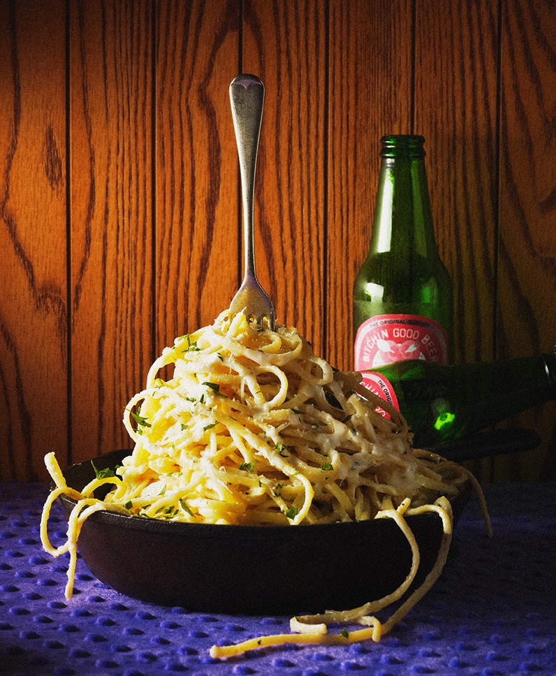
Bitchin Kitchen Cookbook
Photo: Ryan Szulc
Toronto Star Cookbook
photo: Ryan Szulc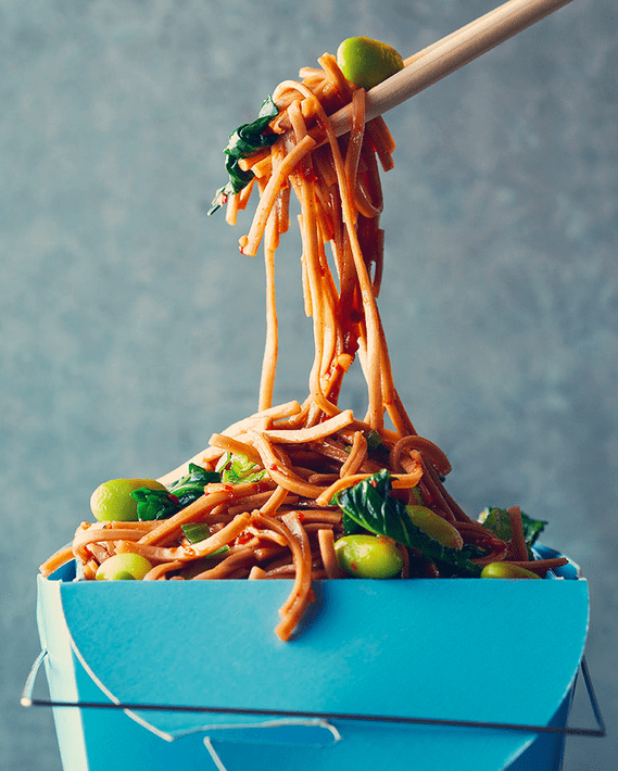
Eat Street Cookbook
Photo: Ryan Szulc
Eat Street Cookbook
Photo: Ryan Szulc